Underwhelmed with Pantone’s Colour of the Year 2024 ‘Peach Fuzz’? Then dive into the rich depths of ‘dopamine décor’, a style that puts vibrant hues front and centre. Words: Kay James, founder of K Interiors.
At K Interiors, we eagerly awaited the 2023 Decorex interior design exhibition, which took place in London in September 2023. After several years of neutral interior trends reflecting the mood of the country as we navigated our way through the pandemic and resultant economic crisis, we were keen to establish whether the design fraternity would concur with our instinct that the interiors world is finally preparing to emerge like a butterfly from the cocoon, shake off the greys and beiges, and launch into a beautiful colour renaissance. The show certainly did not disappoint in this respect. Our hearts were truly uplifted by the array of colours, textures and patterns on display all around us, making it abundantly clear that we are on the cusp of seeing a much-needed injection of optimism and personal joy into our residential interior design schemes.
Joy-inducing colours and homewares
Even the guest speakers were evidence of this new trend for colour, with one panel including the queen of colourful interiors Sophie Robinson, her co-host on the Great Indoors podcast Kate Watson-Smythe, and the doyenne of upcycling and chalk furniture paint Annie Sloane.
Their talk focused on how to embrace colour in your home interiors, and they each started by sharing their first memories of colour. Interestingly, and somewhat surprisingly, Robinson’s first memory was of something white!
Surrounding the exhibitors were bright and colourful sets provided by Yes Colours, there was a fabulous wall-mounted felt colour wheel and a rainbow tunnel (both great for Instagram), and colour trails designed by behavioural design consultant Karen Haller.
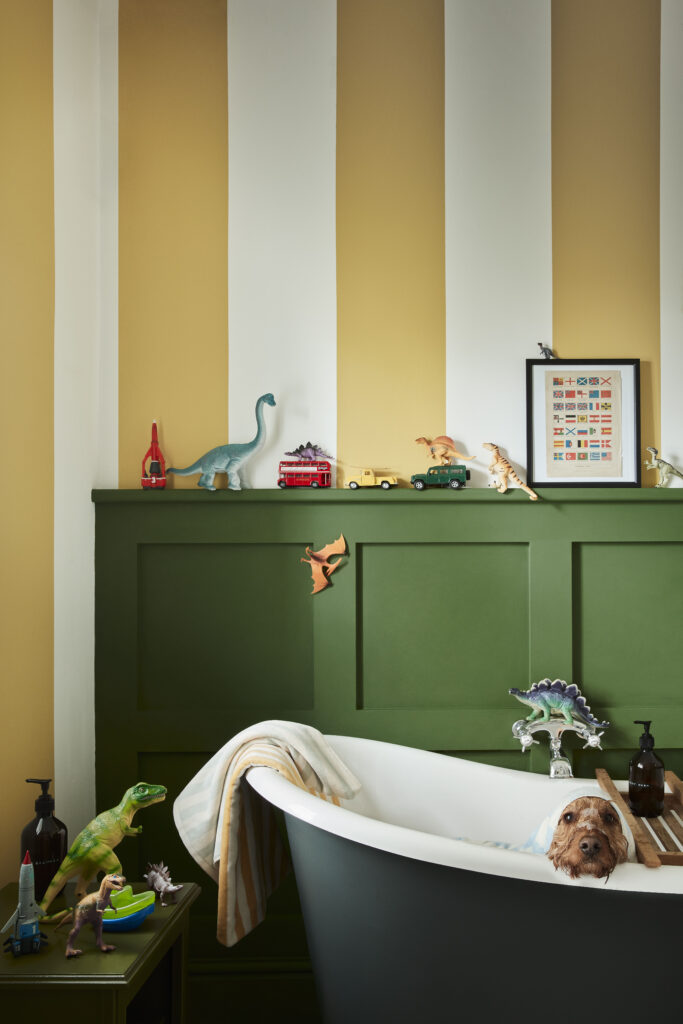
New paint colours being launched by companies such as Little Greene and Coat included deep earthy tones, such as terracotta, claret and burgundy. There were colourful salt and pepper grinders and other home accessories from Addison Ross, delicately toned and elegant chandeliers at Rothschild & Bickers, gorgeous bright lampshades and muted pink contemporary glass pendant lights at Pooky Lighting, bold, quirky painted ceramics from Kinkatou Studio, and a new contemporary technicolour range of faux books from Original Book Works. Even the cisterns displayed by Thomas Crapper had been given a modern edge and were displayed in the brightest of hues. Literally everywhere we looked, there was colour!
Why colour is important in interior design
We spend a lot of time in our homes, particularly during the long winter months, and the colours we choose to surround ourselves with have a big impact on how we feel when we are in a space. The colour palette used when designing any given room or space needs cohesion, so that the colours within the palette work together to evoke the emotional response the user would like to achieve.
When considering introducing colour into your home, the first thing to think about is how you want to feel when you are in your home in general, or a particular room.
by Little Greene (littlegreene.com)
The psychology of colour
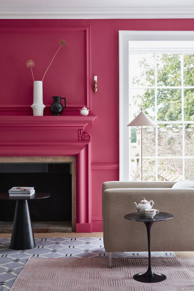
Traditional colour psychology suggests that certain colours are good for different environments and elicit a particular mood or feeling. For example, cool colours, such as blues and greens, are thought to be calming and aid concentration. Green is also considered to be fresh and optimistic – the colour of spring and of nature. Reds, pinks, oranges and yellows are energising, uplifting and stimulating, while warmer and deeper toned colours – burgundy, browns and deep blues, for example, create a cosy, comfortable feel. It’s not just the colour, but also the tone of the colour palette that will affect a person’s response to any room design scheme. Deeper, bolder tones can inspire confidence, while lighter hues are often linked to tranquillity and serenity. In our experience, although the above is a general rule of thumb, each individual will react to colours and tones differently and personal preference is the main factor when deciding on a colour palette for your interiors.
What colours do you enjoy and connect with?
When considering how you want to feel in a space, think about the colours you love and that make you happy. You might look to your wardrobe for inspiration, go to a craft market or art gallery, look at displays in shop windows, or flick through a fashion or interiors magazine. What colours draw your eye? Which do you find more and less appealing?
When in doubt, go back to basics and look at the colour wheel! When deciding on colour combinations for your home, you could opt for a tonal scheme using different tones of only one colour. Alternatively, you might choose a harmonious scheme where colours that sit alongside one another on the colour wheel are used within a room or space. You could also consider using a contrasting scheme, where colours positioned opposite each other on the colour wheel (‘complementary colours’) are used to create a more dramatic effect. The most important element when putting together colour combinations is balance.
Colour-focused interior design
At K Interiors, we are all about colour, whether it be subtle or more defined and impactful. We very much believe that living in an environment surrounded by the colours and designs you love can improve well-being and make you feel more positive. We want our clients to really enjoy and look forward to spending time in their homes and, with that being the case, every client briefing begins with an extensive colour consultancy session.
One of the key purposes of an initial client briefing is for us to understand how our client responds to a range of colour palettes, patterns and textures, along with how the client wants to feel when they are in the room or space we are designing. We want to know what the room will be used for, who it will be used by, and at what time of day. When using the room, does the client wish to feel energised and stimulated, uplifted, relaxed, comforted, calm or focussed? All of these factors, along with the amount of natural light coming into the room and direction in which the room faces, will influence the choice of colour palette and colour combinations.
Seasonal colour palettes
We often refer to there being four seasonal colour palettes for interiors. Spring colours tend to be fresh, playful, bright, uplifting and clean – warm, bright shades, such as sunshine yellow, fresh greens, satsuma orange, fuchsia, and pastel colours mirroring the lovely soft shades of spring tulips as they poke their heads through the soil for the first time. The summer palette is more muted and includes cooler shades – soft neutrals, such as lilac, dusky pinks, sage green, soft teal blues and pale yellows. It is cool, tranquil, classic, traditional and sometimes feminine.
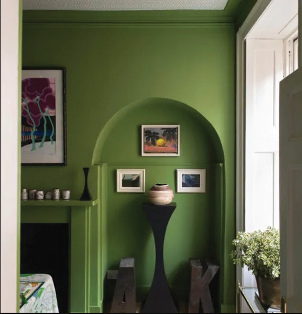
Autumn personalities are drawn to the earthy, natural, rich and often fiery colours of that season. These create a cosy atmosphere and allow us to feel warmth and comfort. The palette includes deep yellow and oranges, browns, claret reds, terracotta and deeper greens. The winter palette is more minimalist, with striking contrasts. It is bold and dramatic, consisting of primary colours, along with cold tones, such as icy blues and greys, with elements of deep blues, red and black.
Sustainable design for longevity
At K Interiors, although we are always keen to keep abreast of colour trends, we do not follow the latest colour fads. This is why it is so important for us to ensure that the design schemes we produce reflect the client’s personality and true colour preferences. Once these have been identified, we are able to create an interior design scheme with the intention of it bringing joy for many years to come.
Designing for longevity also means our designs are more sustainable and do not need to be altered to reflect the latest trends of the design world. Although in time our clients might wish to make superficial changes to refresh the look of a room by changing up smaller items, all the original key elements will stand the test of time.
In our experience, a well-considered residential interior design scheme can lift the mood and bring the user a huge amount of joy. Why live in a drab, grey and beige world if those colours do not make you happy? At Decorex, it genuinely seemed that both attendees and exhibitors were more upbeat than in previous years.
Given that K Interiors’ world revolves around colour, we can’t help but put that down to the riot of colour on display. Mark our words, dopamine décor is making a comeback!
k-interiors.co.uk